Better vertical spacing with :not(:last-child)
For a long time, I got away with haphazard vertical spacing on my web projects. I’d put things on the page, and start adding margins, paddings… whatever I needed until things looked balanced and right.
It usually worked, but sometimes I’d have to work around silly issues, like these:
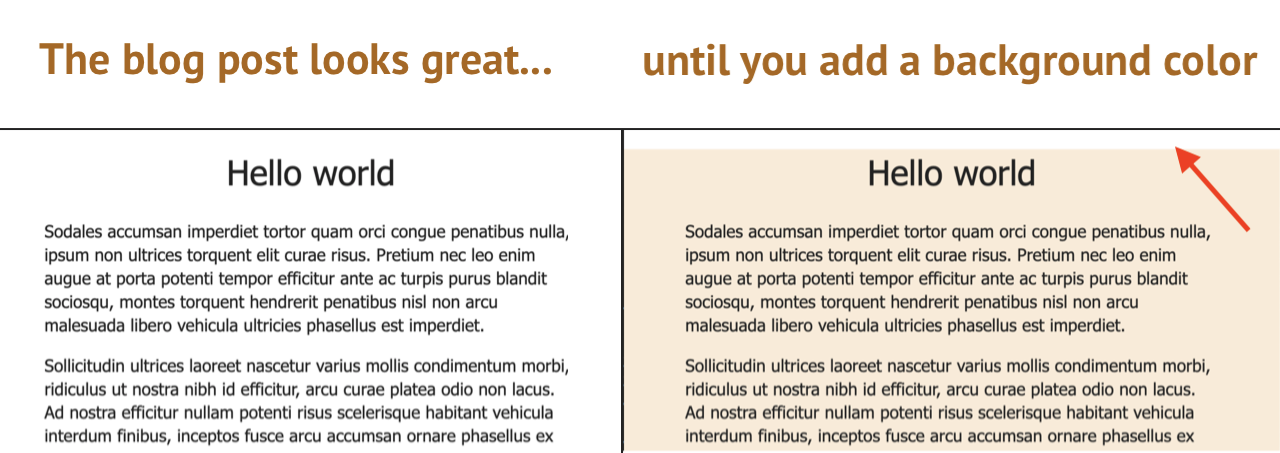

Web developers with some experience will recognize these issues. We’ve got overflowing margins on the first, and collapsing margins on the second (or more accurately, a case where the default collapsing margins fail us).
Harry Roberts has a little rule for avoiding these kinds of situations: single-direction margin declarations.
To quote his blog post:
The basic premise is that you should try and define all your margins in one direction. This means always use margin-bottom to push items down the page, and margin-left to push them across the page.
In other words: we need to banish margin-top and margin-right.
Let’s look at an example of a sidebar that does this:
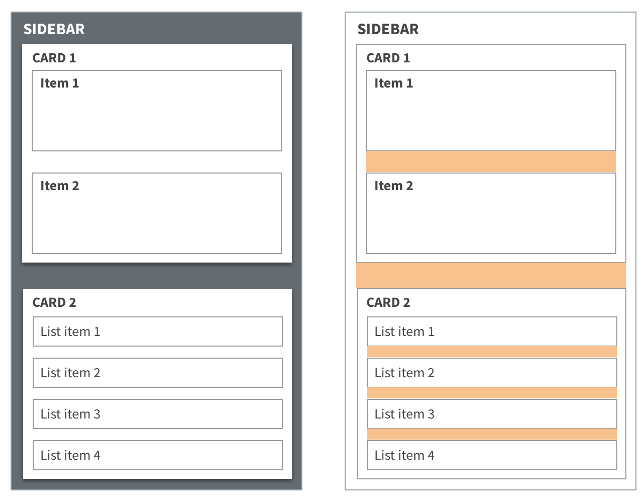
It works pretty well, but one thing you’ll notice is that we never actually want margins on something when it’s the last item in its container. Look at the last “item”, the last “card”, and the last “list item”. None of them should have a margin-bottom.
Enter :not(:last-child)
:not(:last-child) is a css selector combo that targets all elements, except the last one in the container. It’s perfect for applying margins in our situation. Here’s what the sidebar styles might look like, with not(:last-child):
// This is SCSS, but you could do the same with CSS
.item {
  padding: 4px;
  border: 1px solid gray;

  &:not(:last-child) {
    margin: 10px;
  }
}

.card {
  padding: 4px;
  background-color: white;
  box-shadow: 0 2px 4px #444;

  &:not(:last-child) {
    margin: 14px;
  }
}

.list-item {
  padding: 4px;
  border: 1px solid gray;

  &:not(:last-child) {
    margin: 8px;
  }
}
Why I like it
I like how future-friendly this approach is. It doesn’t matter how much content is in these lists and sidebars. Zero items, one item, one-hundred items… the spacing will always look good. That makes it convenient for developers and great for data-driven UIs.
There are other ways to apply similar styling. You could have a .last class generated on the server, or create a separate :last-child rule, but I like how :not(:last-child) doesn’t require any styling overrides.
It might be interesting to try to apply this rule more broadly. Maybe there’s a way to use wildcard selectors that isn’t overbearing. Or maybe you could build a sass mixin that makes it more convenient. I may have to explore that a bit.
Summary
For fewer vertical spacing headaches:
- Margins should only come from one direction.
- The final item in a container should never have a margin.
&:not(:last-child) is a nice little selector for defining these margin styles. It’s descriptive, dynamic, and future-friendly.