Connect Four: a case-study in invisible interface design
I’m always impressed when I come across an online tool or website that’s so simple that there’s practically no interface at all.
One example of this might be this keycode reference site by Wes Bos:
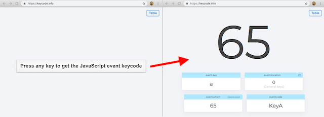
There’s no fancy landing page or detailed explanation of how it works. There’s nothing standing in your way at all.
I attempted my own “invisible interface” design recently and it took some trial and error to get it where I wanted. This post is my attempt to share that process.
My goal was to make an online version of Connect Four with a minimalist UI. I wanted to support the following features:
- two-player gameplay
- customizable player names
- keyboard accessibility
- win-detection
- a replay button
First attempt: native browser dialogs
The main UI came together pretty quickly:
As you can see, I used native browser dialogs to prompt the user for player names. This kept the code simple, but the dialogs felt aggressive and I wanted a better way to get player names.
Second attempt: a setup screen
I decided to replace the native prompts with an in-page modal-style prompt. I thought this would be better for two reasons:
- You could change both player names in a single modal, reducing the number of clicks.
- I’d have more control over the design, so I could improve the look and feel.
Here’s what that ended up looking like:
It required fewer clicks and was less aggressive but there was a problem: The interface was very much NOT invisible.
Now we had a new whole screen of form elements, not to mention this new persistent title bar thing. Plus, having two “pages” added complexity, creating weird edge-cases for keyboard accessibility
I realized that we were forcing all players to go through this naming step, when it was likely that many players would be just fine with the default names. So how could we redesign it for players like that?
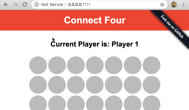
Third attempt: let’s just play
I tore out the setup screen and started working towards this third design:
Now we don’t get in anybody’s way. People who just want to play can. And unlike previous versions, the player names can be changed at any point in the game without losing progress.
One defining feature of this last design is that by clicking the name to change it, we’re stepping towards making the content itself the UI. This kind of thing has become common on touchscreens and it’s a feature of so-called Natural User Interfaces:
“[Natural User Interfaces] aim to make content itself the interface by turning content into things you can manipulate and act on directly.”
Luke Wroblewski, Netflix Makes Content the UI
For what it’s worth, the game board works the same way: everything you see is content that you can interact with.
Now, as far as design exercises go, this was pretty basic. Connect Four is way less complicated than the enterprise software many designers are working on.
But it showed me that it can take several passes to simplify things down to their essence. Overall, it was a fun little challenge and it felt good to exercise those muscles.
(note: you can play the final game over at bryanbraun.com/connect-four)