If Gmail were built with Drupal
So what are you trying to say?
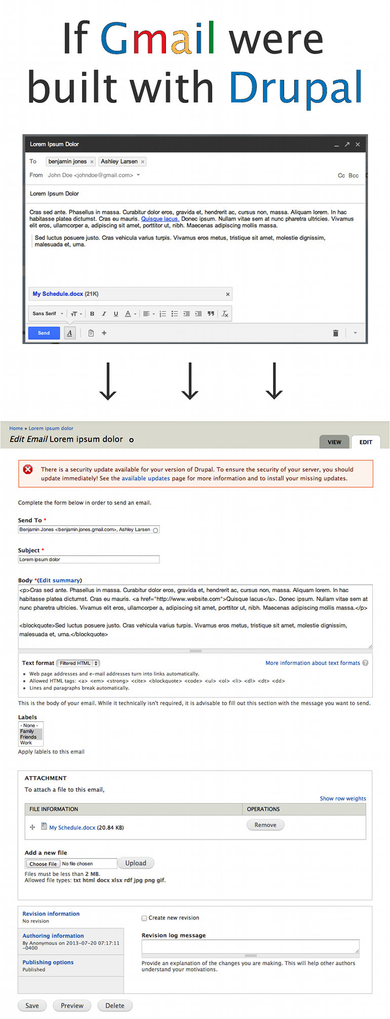
Admins and content creators who use Drupal are going to compare their experience using Drupal to the other modern web applications they use, like Facebook, Evernote, and Gmail. Many of those products have entire teams of usability experts who optimize their products for their users. While Drupal has come a long way, just comparing the interfaces is instructive for showing us where we can improve.
Is Drupal’s interface really that bad?
It works, but the data is in and content creators are struggling. The form is long, which is intimidating, and requires scrolling to complete. It’s long because space isn’t always used efficiently, with wide gaps in some places, and seldom-used features taking up a lot of room. The form itself lacks some of the more clever and user-friendly form elements that other applications use for autocomplete, tagging, multiselect, drag and drop, and others.
What do we do?
We raise awareness. We explain that if Drupal is succeeding, it is despite its authoring experience, not because of it. We acknowledge the issues that exist, and we chip away at them in the core issue queues as much as we can. Then we celebrate every victory we have (three cheers for the improved installation interface!).
And in the mean time?
There are plenty of small things you can do to improve things on your existing sites. Integrate better form elements. Simplify the node-edit page. Try out some alternative admin themes. Organize your fields to help reduce confusion. There are a lot of contributed modules that can help empower your content creators, and if you can’t find the one you’re looking for, then build it (and share it with the rest of us). Piece by piece, we can make Drupal actually feel like the modern web-publishing powerhouse that it is under the hood.
Note: This image came from a talk I gave at Capital Camp, where I go into more detail about the specific issues in the Gmail clone, and some things site builders can do to improve things. If you find this topic interesting (or you just want some more context around this example), go check it out.