5 Takeaways from Learning CSS Grid
I’ve been keeping an eye on CSS grid for a while, but now that browser support is getting pretty good, I thought it would be a good time to jump in and learn it.
So while I was at ng-conf, I attended a workshop on CSS grid run by Dave Geddes. It was great.
So without getting too much in the weeds, I thought I’d share 5 of my biggest takeaways from learning CSS grid at the workshop:
1. Don’t be afraid of the FR unit
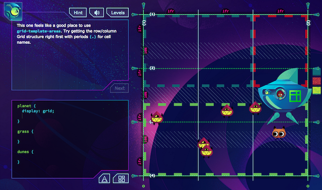
CSS grid includes a new unit (like px or em), called fr, which is only designed to be used in CSS grids. It stands for “fraction,” but all you really need to know is that it’s for sizing grid rows/columns relative to each other. So if column 1 is 1fr and column 2 is 2fr, column 2 will be twice as big as column 1 (kind of like the flexbox numbers for flex-shrink and flex-grow). It’s new and unfamiliar but don’t be afraid of it! It’s kind of the CSS grid way of doing things, so I’d encourage you to make it your default grid-sizing method.
2. Build your grid one step at a time
CSS grid has a lot of properties and it takes time to add them all. If you apply them in the right order you are less likely to get lost. The process that worked best for me was:
- Declare the correct number of rows and columns (via
grid-template-rowsandgrid-template-columns) using1frunits for everything. - Make adjustments to the row / column sizes as needed.
- Add gaps or gutters as needed.
- Position content as needed
3. Use a grid layout tool (like the one in Firefox)
Using a grid layout tool, like the one that comes with Firefox, makes it way easier to see what’s happening as you’re building your grids. Don’t worry! You don’t need to learn a fancy new tool or explore all the features. If you just open it up, enable the “Overlay Grid”, and do nothing else, you can keep developing as you normally would, but you’ll be able to visualize your grid much better.
4. Name your grid lines
By default, each of your grid lines has a number, which you can use to reference it. But you can also name them, and good names can help make your CSS cleaner (kind of like having good variable names in your Sass or Javascript). You don’t have to name all of your grid lines if you don’t want to (arbitrarily naming them all can be confusing!). Simple names like top and bottom are a good place to start. If your grid has meaningful content divisions (like headers or footers), you can name your grid lines after those to clarify your code even more.
5. Use shorthand properties… or don’t!
Like Flexbox, CSS grid has a ton of shorthand properties which you can use to make your code more succinct. You should use them if you want to… but don’t feel like you have to! If you’re just getting started, it can be confusing to learn multiple syntaxes. So don’t! Practice by using the explicit properties first, and only move onto using shorthand when you feel confident with the basics. Ultimately, shorthand is there to make your life easier, not harder.
I could go into much more detail about grid, but there are already a bunch of great resources out there that do that. I got to try some of the challenges from Dave’s Grid Critters course, and I was way impressed with how everything worked (and how challenging it got). So if you want to learn CSS grid in a fun and comprehensive way, go check it out.